Clear thinking.
Better
systems.

A distinctive mark.
A direct voice.
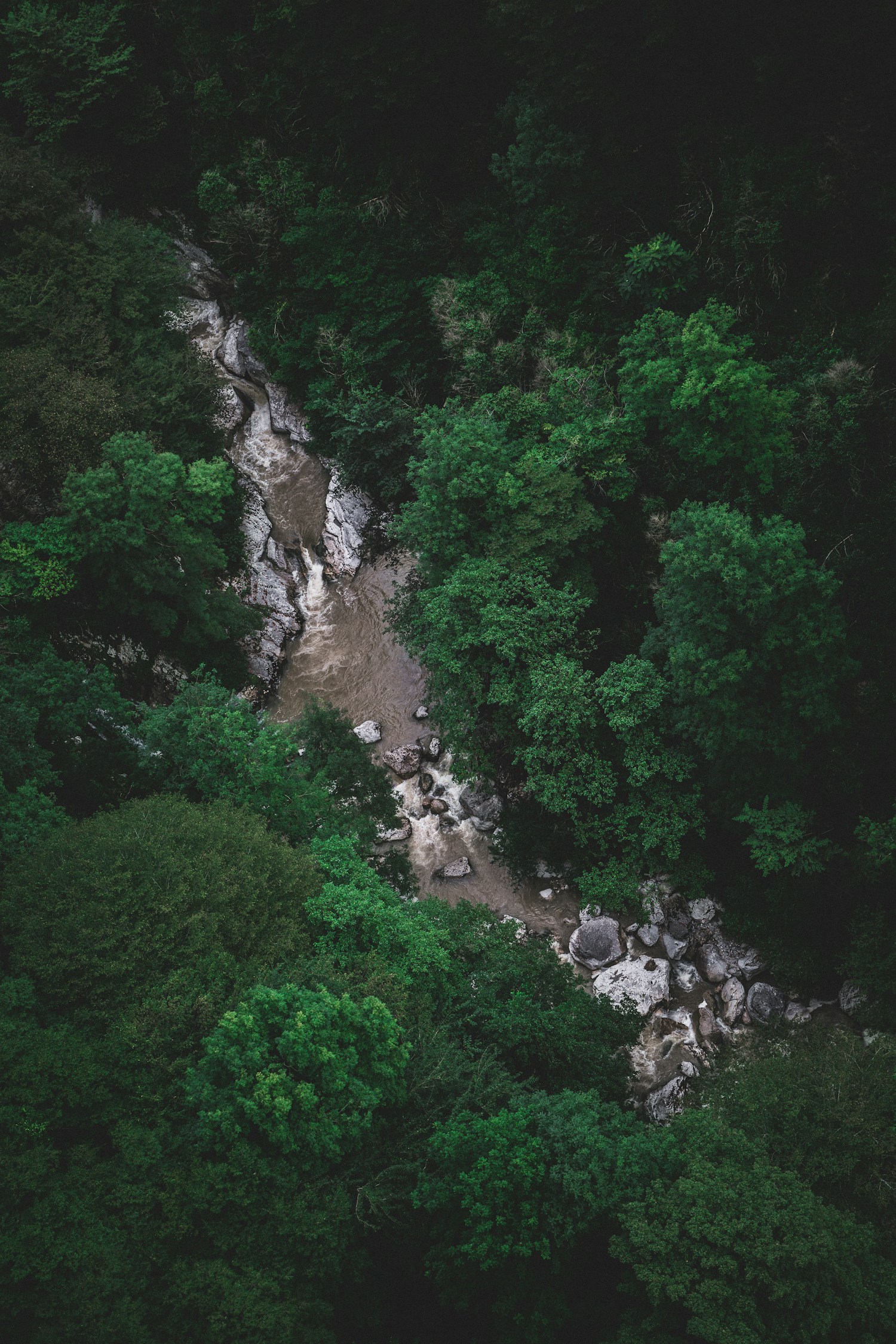
The river-shaped R gives Riverly a recognizable signature. Bold typography and strong contrast keep the identity clear and confident. Landscape photography connects us to our home on Lake Superior; it provides context, not a metaphor for everything we do.
The Riverly mark.
A river-shaped R paired with the Riverly Systems Co. wordmark. Use the supplied artwork consistently, without modification.
01 — Give it space Keep clear space of at least ¼ of the symbol’s height on every side.
02 — Keep it honest Never stretch, rotate, or add effects. Always use the original artwork.
03 — Make it legible Minimum width: 32px for the symbol, 200px for the full lockup.
A palette from the landscape.
Deep greens, quiet neutrals, and a little light. Colors that feel as grounded as the systems we build.
Let Forest lead. Use lighter tones to create space, not noise.
A consistent identity in both modes.
Light and dark modes share the same hierarchy and identity. Keep text and logos clearly readable in both.
Light surfaces.
Strong contrast.
Quiet, open surfaces for clarity. Anchor them with deep green and decisive dark elements.
 Stone + Forest
Dark surfaces.
Clear hierarchy.
Rich, dark fields for focus and presence. Let pale typography and natural imagery come forward.
Ink + SageSame logo. Same voice. Different light. Forest and Ink stay dark in both modes—contrast is deliberate, not simply inverted.
Clear words. Characterful type.
Alata leads headlines and key statements. Manrope keeps supporting copy readable, with DM Mono reserved for labels.
Alata
A modern geometric sans with a human touch.
For headlines, brand statements, and key moments.
ABCDEFGHIJKLMNOPQRSTUVWXYZ
abcdefghijklmnopqrstuvwxyz
0123456789 !@#$%&*()
Manrope / Supporting voice For body copy and interfaces. Open, precise, and quietly confident.
DM Mono / The details For labels, specifications, and quiet moments of structure.
Photography with a sense of place.
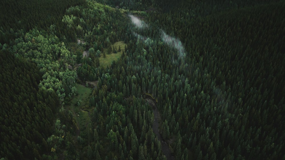
Landscapes add texture and connect the identity to Lake Superior. Keep them as visual context, not a substitute for explaining the work.
Keep it real
Natural landscapes. Honest light. Nothing staged, nothing artificial.
Find the structure
Look for clear compositions and patterns that complement the mark without competing with it.
Keep color restrained
Use rich shadows and layered greens. Avoid oversaturation and keep overlaid text readable.
One identity. Many expressions.
Use the same logo, typography, and direct language across print and digital applications.
Clear thinking.
Better systems.
Independent consulting. Better systems.
A better way forward.